Austin Business Woman Redesign
Scope: Elevate the e-commerce experience by improving product discovery for customers and enhancing business owner profile pages for clarity and usability
Participants: Myself, Jeromy Coleman & Alexis Yarnell
Duration: Three week sprint
Empowering Women-Owned Businesses in Austin In response to the pandemic’s economic impact, Olga Adler launched Austin Business Woman—a platform to connect and promote women-owned businesses across Austin. With a strong mission but an underperforming website, Olga teamed up with our team to bring her vision to life.
We redesigned the platform to be simple, intuitive, and beautiful—supporting both business owners and customers with a layout that makes discovery easy and community connection seamless.
Discovery
Initial usability testing of the current website, Comparative & competitive analysis, Survey, Heuristic evaluation, Task analysis, Site-map, User-flows, User interview
Usability Testing Round 1:
To better understand how consumers and business owners were interacting with the site, we conducted usability testing from both perspectives—revealing three key insights.
Overwhelming Homepage
The homepage featured 26 sections, reflecting the client’s desire to spotlight as many businesses as possible—but the result was an overcrowded, overwhelming experience for users.
Repeating Calls to Action
Users reported difficulty finding key features, leading to duplicated buttons across the interface—like a “Home” tab appearing both in the global menu and beside the login button. A separate “Homes” tab for real estate listings further added to the confusion.
New Member Onboarding:
Signup confusion was a major pain point—business owners struggled to register without guidance, while customers weren’t sure the site was meant for them, as it appeared primarily targeted toward vendors.
Membership plans were difficult to compare due to excessive scrolling and inconsistent visual design. While each plan—Premium, Professional, Essential, and General User—contained helpful details, poor readability, mismatched styling, and unclear naming (especially the “General User” tier) left users confused. Many also misunderstood the site’s purpose, mistaking it for a networking platform rather than a tool for discovering local goods and services.


Competitive Analysis - What are other directories doing?

Key Findings:
Clear distinction between target audiences
No separate user accounts (or shared accounts for users and businesses, as seen in MyArea)
Business information was easy to access
Comparative Analysis - What are the experts doing?

Key Findings:
Amazon and Yelp offered separate onboarding flows for business owners
Etsy linked business onboarding to existing user accounts
All platforms featured a prominent, easy-to-locate search bar
User Survey:
Understanding Online Shopping Habits To enhance Austin Business Woman’s shopping experience, we surveyed users about e-commerce, convenience, and local support.
Participants: 12 surveyed
Age range: 58.3% between 29–39 years old
Local support: 100% want to support local businesses, but find it hard when shopping online
Shopping behavior:
Arrive knowing what they want
Read reviews
Save and compare products
Google Analytics:
Site Analytics (Sept 1 – Nov 1, 2021)
33.5% of users were aged 25–34
12.6% were returning visitors
Most visited pages:
Home
Buy
Search Results
Jobs
Bounce rate: 60.1%, significantly higher than the 47.4% e-commerce average
Planning
Personas, Hypotheses, User-flows, Site-map
Task Analysis
A key challenge was simplifying onboarding. I analyzed each step of the current process and compared it to platforms like Etsy and Yelp. Etsy offers a comprehensive but complex flow, while Yelp keeps things quick and simple. Austin Business Woman had little to no onboarding—especially for customers. We saw an opportunity to merge the clarity of Yelp’s structure with light e-commerce elements inspired by Etsy, creating a more intuitive experience for both audiences.

Personas & Target Audience - Personifying two user flows

Business Persona: Sarah Griffith
Owner of Sarah’s Candle Lab
Needs and Expectations:
To showcase her products.
Drive more customers to her e-commerce website.
Network with other female business owners.
Grow her candle business.

Customer Persona: Shannon Ringer
Holiday Gift Shopper
Needs and Expectations:
To shop for women owned, local businesses.
Be able to save items she likes.
Read reviews and follow recommendations.
Find multiple products in one place.
Be able to search for specific items.
Hypothesis 1: Shannon’s Solution
We believe that by making the shopping experience reflect common e-commerce experience, and by providing a clear message when users are being taken to a new page Shannon will be more comfortable shopping on the Austin Business Woman website since it feels more familiar.
Hypothesis 2: Sarah’s Solution
We believe that by creating a minimal design and clarifying website language, Sarah will better be able to utilize marketing options and better advertise her products.
User-Flows - Customer and Business owner

Site-Map

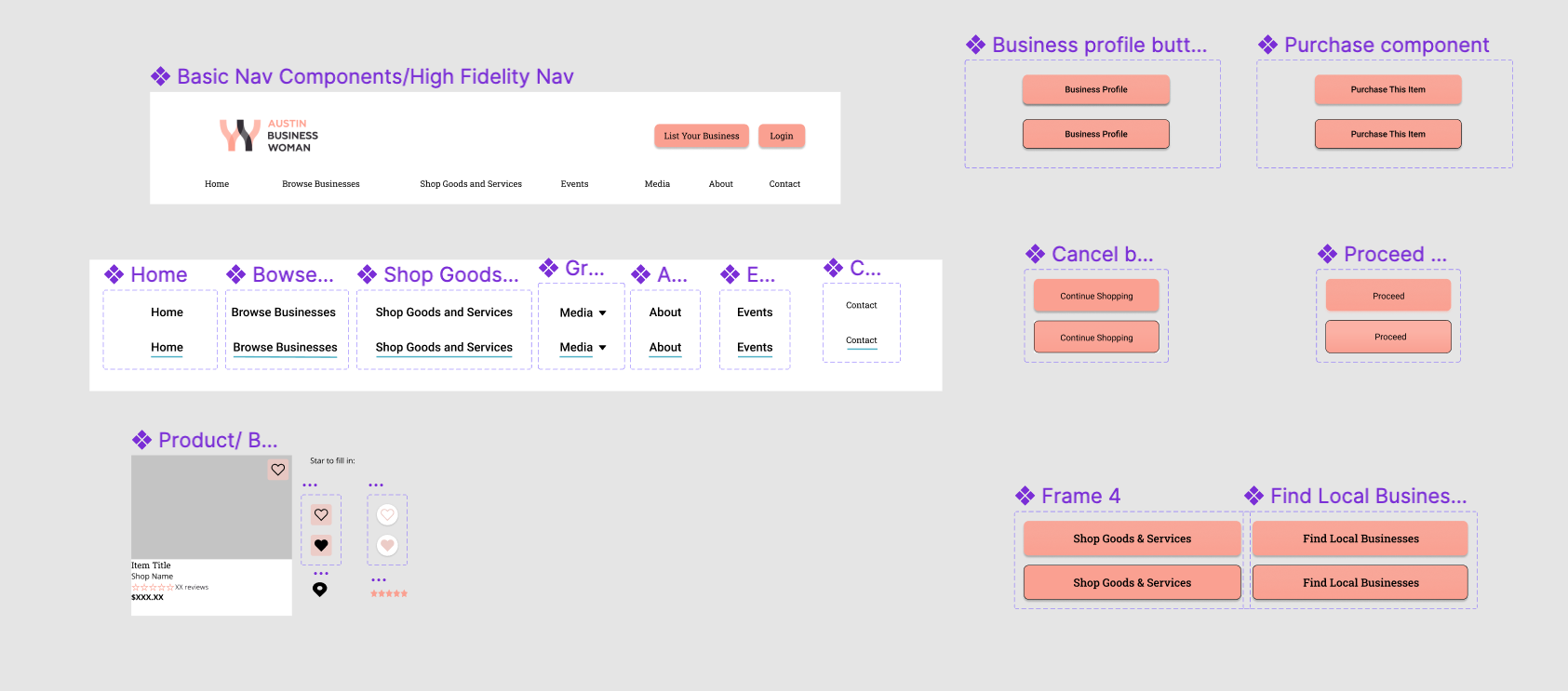
Streamlining the Global Menu Usability testing and a heuristic review revealed that the original global menu was overcrowded, making navigation overwhelming. While Olga wanted to showcase a wide range of services, we saw an opportunity to improve usability by organizing content more efficiently.
Original Menu: Home, All Businesses, Digest, Buy, Deals, Photos, Videos, Event, Blogs, Work, Homes
Redesigned Menu: Home, Browse Businesses, Shop Goods and Services, Events, Media, About, Contact
To support this shift, I developed a site map to guide our redesigned structure and simplify user experience.
Designing
Sketching, Wireframing
Sketching:


Wireframes:


Usability Testing - Round 2
A/B testing & Iterations

A/B Testing:
Improving the Membership CTA To boost visibility, we tested two placement options on the homepage:
Option A: Small CTA in the top right corner, next to the login
Option B: Larger CTA placed lower on the page
Winner: Option A—more noticeable and effective
Clarifying Onboarding Language We updated the business onboarding button from “Become a Member” to “List Your Business” to reduce confusion and better reflect the action for new vendors.
What Shannon Is Looking For?
Breadcrumbs for easier site navigation
Grouped products to minimize vertical scrolling
Filtering options:
Category
Item type
Price
Special offers
Distance
Ability to 'like' items, saved to a personal dashboard for later
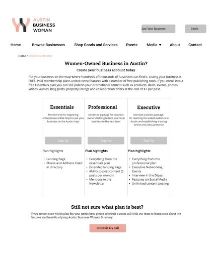
Membership Description Page Feedback
We redesigned the page from a basic list format to three side-by-side boxes, each with a brief description. Usability testing revealed key opportunities for improvement:
Layout: Users preferred a traditional comparison matrix with a grid and check marks for easier scanning
Missing Information: Prices were not included—making it harder for users to compare options
Content Clarity:
Brief descriptions were appreciated
Users wanted more detail on specific perks (e.g., Digest, Social Media Stats)
“Highlights” implied more content—users requested a clear “Read More” option

High Fidelity Designs

Design System Contributions
Global Menu: Added a subtle blue underline on hover, drawn from our style guide, to provide visual feedback and reinforce brand consistency.
Buttons: Introduced hover states with a black outline and slight rounding—offering a tactile cue inspired by current UI trends to indicate interactivity.
Homepage Enhancements
Streamlined layout for a cleaner, more focused user experience
“Member of the Week” feature added as a key spotlight element, also promoted on social media
Events calendar redesigned to be more prominent and interactive, improving user engagement

Hierarchy:
Greyscale:
Users were concerned about the hierarchy of information on the business profile pages. We decided we could tackle this by moving valuable information such as, the map/location, basic information about the business and the business owner bio closer to the top of the page.
Since all of the information couldn’t live in the same place, we decided that by adjusting the size and spacing of page elements, each one would be highlighted equally in a way that makes sense to the user.
Hi-Fidelity:
All of Sarah’s candle lab information is at the top of the page:
Logo
Mission
Location
Contact and Social Media
As you scroll, featured products for sale, followed by Sarah’s bio, “The Woman Behind the Business.”
There is space for more information about the store and a space for blog postings or other content she wants to share on the page.


Shop Goods & Services:
Shannon can either use the search bar (Figure A) to look for specific products or brows e using the the Shop Goods and services Tab (Figure B).
The team made sure to showcase the filtering menu on the side bar. As Shannon, our customer is looking for candles she can filter through content to find what she is looking for.
The bottom of the screen also includes a list of deals and coupons!

Figure A

Figure B
Product Description & Third Party Website Disclaimer:
After selecting a product Shannon can see a description of the product, reviews, social media links and ads for more products from Sarah’s Candle Lab.
We added a disclaimer to the product description itself as well as a pop-up when you click “Purchase this Item.”
Users were actually very excited to know they were traveling to a third party website to make purchases. They thought it was great that they got to see more of the business and felt the purchasing process was much more honest.

The Hi-Fi Matrix
Our user’s liked that the membership plan descriptions were next to each other but there was room for improvement. Now when new members are adding their business they get all the information they need, including the price, an option to read more about each perk and an option to schedule a phone call if they need it.
At first glance, the check marks make the benefits of the executive plan stick out. This is meant to increase trust from our users because they will have a better idea of what they are getting and how to use it.
When Sarah decides to renew her membership next year, she will be more include to sign up for the executive plan!

Responsive Design:
It was extremely important to us and our client that the directory work well on mobile devices.
We designed each of our flows in a drop down column format for iPhone 13.

Being able to filter through goods and services is still very easy. The icon under the burger menu at the top is commonly placed as a filtering icon.
From anywhere, Shannon is still able to narrow down her search to find exactly the gift she needs.
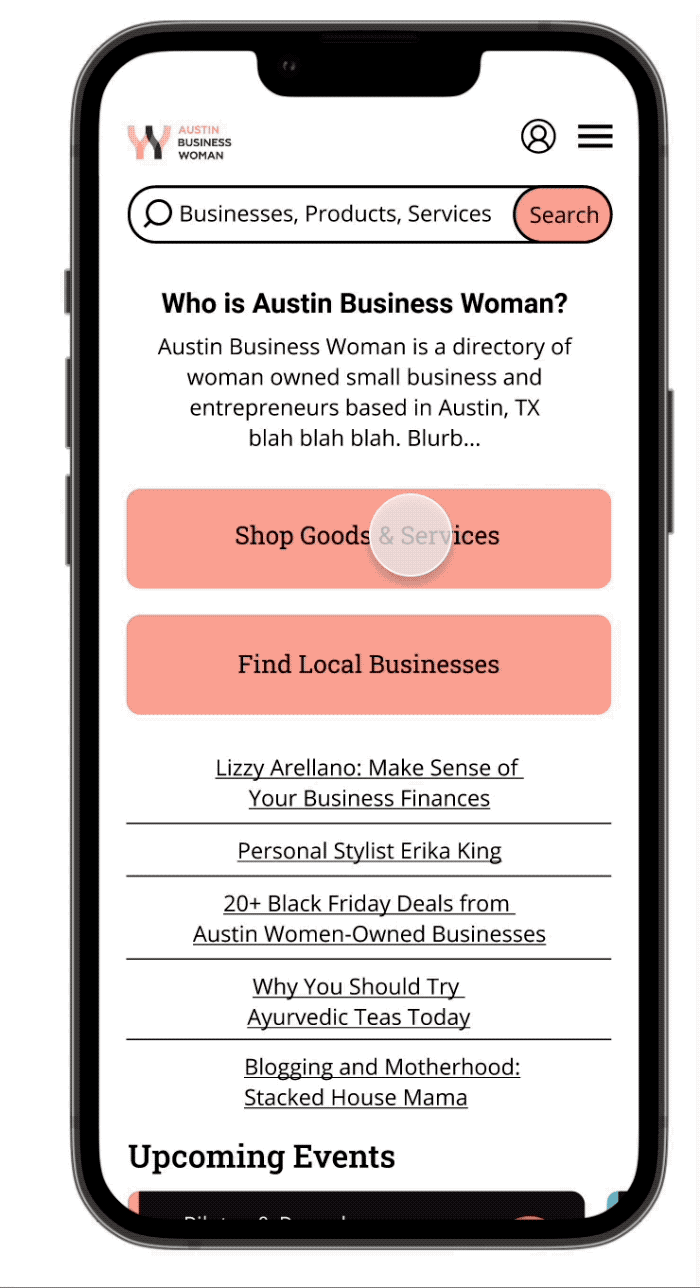
Listing your business is also very easy on the go!
Under the account icons, business owners are taken to a scrollable matrix. Our more traditional Martin is better suited for a laptop or desktop screen.
Each other the business plans are easy to see on one screen this way and business owners can compare features easily.

The product description and business profile page look very similar, just conduced into scrollable columns.
The product description page has everything Shannon will need to make a good purchasing decision.
When you hit purchase this item the same disclaimer about moving to a third party website appears.
The business profile is very scrollable. we wanted to keep customers engaged by keeping the same hierarchy.
Deliverables:
For a full rundown of our research please click here, or on the image below which will take you to our project report. There you can read extensively about our research and synthesis or simply observe our charts and Figma file in the Appendix.

My Contributions
Collaborated across the team on:
Usability testing
Competitive analysis
Persona creation
Client and developer meetings
Survey development
Final project report
Led or directly contributed to:
Task analysis and user interviews
Site map creation based on the redesigned global menu
Wireframes for product description and business owner profile pages
Discussion guides for usability testing
High-fidelity prototypes for key pages
Methodology Overview
Our design process combined research, analysis, collaboration, and iterative design:
Research & Evaluation:
Usability testing (current site)
Heuristic evaluation
Comparative & competitive analysis
Survey and user interviews
Task analysis & affinity mapping
Planning & Ideation:
Site map & user flows
Design studio workshops
Sketching sessions
Execution:
Wireframes
High-fidelity mockups
Developer collaborationHeuristic evaluation
Task analysis
Affinity mapping
Site-map
User-flows
User interview
Design studio
Sketching
Meeting with developer
Wireframing
H-fidelity mockups
Thank You!
This project was truly wonderful to work on. Our client has an amazing website that is building a community of women. As a team, we were so honored to work on a project that not only improved the business for one person but hopefully many.
During our sprint we found there was more potential to work through but unfortunately with our limited time, it did not fit into our scope. The developer was kind enough to speak with us about our designs and evaluate what was possible. We conducted a card sort to try and narrow down some of the categories listed on the site but because of the way they are stored on the backend, the task will be tedious and expensive.
However, we did learn a lot about the power of APIs which help others format their content to match our clients, that was a big win.
Again, this project was a true joy. My team mates are amazing and we are so thrilled to have this on our portfolio.