Trouble in the Neighborhood:
Combating Misinformation & Bias on Nextdoor
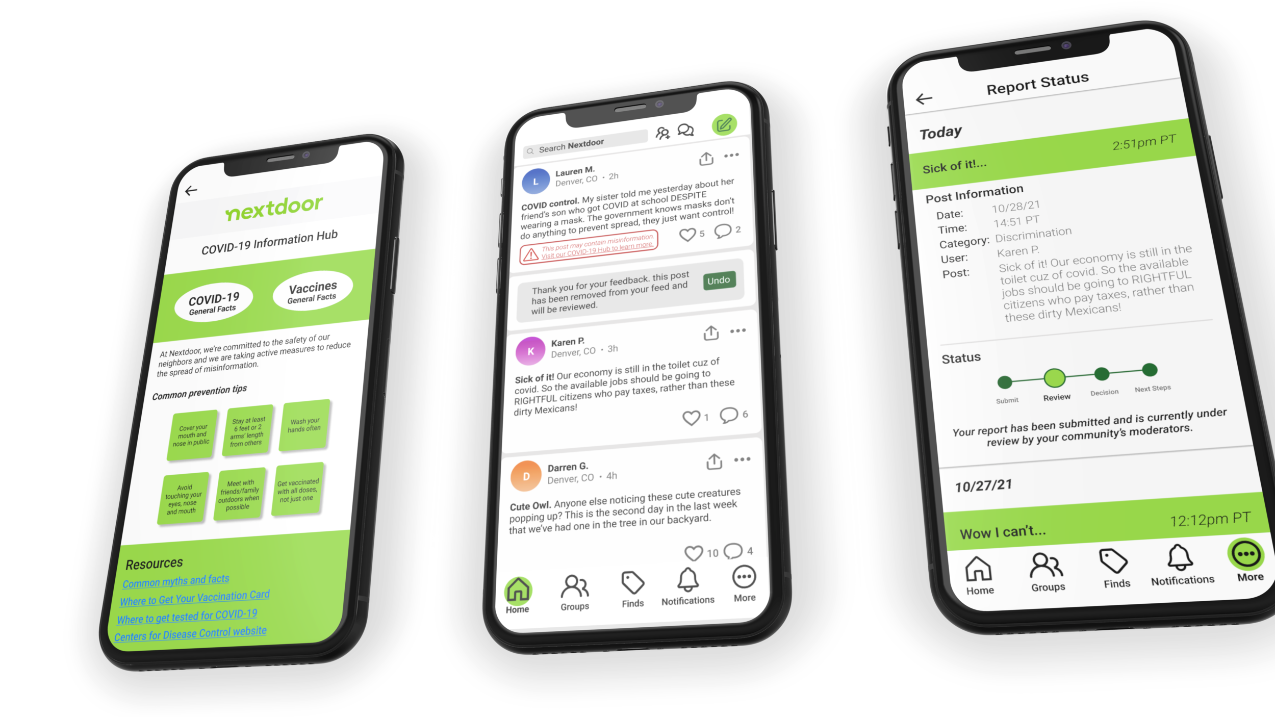
It Takes a Village…
Student Project/ Speculative
Three Team Members: Resarani Johnson, Kyle Peterson & Myself
Duration: Two Week Sprint
OVERVIEW
Social media struggles with the balance between free speech and filtering harmful content. Nextdoor has made a significant effort to combat this challenge but has earned a reputation for propagating negative content & inducing negative interactions within small communities. The scope of this project is vast to say the least but it is our goal as a team of UX designers to identify where the platform is falling short and make changes to create a healthier and safer environment on Nextdoor.
MY CONTRIBUTION
My role throughout the process was: researching competitors and producing a feature inventory for my teammates, help write a user survey and distribute it, synthesize data, create user-flows, sketches during ideation, created wire-frames for specific flow sections, conduct usability testing, iterate the design, create a portion of the high fidelity prototype and produced an responsive design for desktop users.
METHODOLOGY
Business research
Competitive and comparative research
Survey
Affinity mapping
Design Studio
User-flow
Wire-Frame
Usability testing
Prototyping
Responsive design
What is Nextdoor?
Nextdoor is an app/ website that offers a hub for neighbors to share information, and connect with the community. The platform is mainly categorized as social media but it can also be classified as a directory and/or marketplace.
My first encounter with the site was very positive. I took my housemate’s dog on a walk and along the way, lost my keys. I panicked immediately and ran back to the dirt walking path, scouring the ground for my keys and couldn’t find them. Nextdoor was suggested to me by a friend so I immediately downloaded the app, created a profile and posted a distraught plea for help. Within an hour one of my neighbors let me know they had found the keys and left them on a top of a trashcan in the park. This was amazing! I loved the app after that experience.
However, like all social media outlets, Nextdoor has its dark side. In 2020, during the pandemic and the election, misinformation about Covid-19, election fraud and racial tensions ran wild. Nextdoor was no acceptation and unfortunately, these issues pitted neighbor against neighbor in an aggressive way.
This is a story about that tension and our teams best effort to design an effective way to solve such a grandees problem.
Competitive/ Comparative Analysis:
Social Media is under fire & everyone is racing to solve the problem.
Social media platforms have been scrutinized for perpetuating misinformation about election fraud, conspiracy theories, false science concerning COVID-19, cyber-bullying, terrorist recruitment and abhorrent rhetoric from hate groups across America.
In order to re-design a system for handling these sensitive issues, it is very important to take a look at what competitors are doing and compare how those processes/ features are working out for the company and its consumers. What we found was that some companies were facing more heat than other. Twitter for example was much more willing to take action against offenders and use their power as a private business to set a standard for the type of content they were willing to allow on their platform.
Twitter Has The Most Rules About Content
Key Features:
An “Unhelpful” option
A strike system against offenders
Banning repeat offenders for short to long periods of time
Efficient flagging of mis-information or biased content
Serious offenders are kicked off the platform permanently
Data Analysis:
1 in 3 Households Were on Nextdoor During the Pandemic
Now 1 in 5 Households are on the Platform
Average Duration Time:
3.2 Minutes
Drop-off Rate:
48.87%
Our Survey and the Results:
The survey we conducted reached about 15 people, from Atlanta, Washington and Colorado. The sample size was small but reached those in our circle and was steered toward misinformation and hate speech on Nextdoor.
This affinity map was made based on the results we got from out survey. Visually we were able to gage which answers were receiving similar or different experiences on the platform.
As well as how much the participant was engaging with posts.
Users are Disengaging…
Based on these factors, our team identified three clear pain points: users did not trust the reporting process, misinformation was not properly flagged and the interface was not conducive for sharing feedback.
Business is Being Effective by these Issues:
If customers are dissenting, the platform does not perform financially. This MVP matrix helped the team organize our ideas in ways that would benefit the business as well as the consumer.
The MVP Matrix helped the team determine what the business advantage are for this redesign.
We determined that features such as: An unhelpful button (like Twitter), Links to a covid information hub, a progress bar and disclaimers would have a high impact with low effort by the consumer or the design team.
Hypothesizing
How might we limit the spread of misinformation/ hateful speech on Nextdoor & prevent users from disengaging from the platform?
We developed three user flows to reflect the three solutions we came up with:
Proactive misinformation flag
The helpful/unhelpful button flow
Reporting a post
Solution 1:
The Current COVID-19 flag is not cutting it.
Nextdoor’s current COVID-19 flagging (Figure A) is hard to see because the coloring is grey & the copy is small. Also, the link takes you to the CDC website, where the user has to filter information themselves.
We believe that by making the notice larger and more colorful, we can attract more users to learn the facts from an information hub made by Nextdoor (Figure B). That way the right information has already been selected.
Figure A
Figure B
Solution 2:
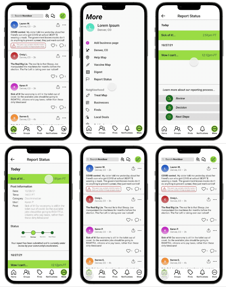
There needs to be more transparency behind the reporting process.
Nextdoor’s current reporting process (Figure A), does categorize violations. However, the Process stops after submitting the complaint.
By adding a progress bar (Figure B), users know what actions are being taken and can check the status of their report after submitting their complaint.
Figure A
Figure B
Solution 3:
The Introduction of the Unhelpful/Helpful Icon
User’s can click the Unhelpful/Helpful icon to provide more feedback.
By clicking unhelpful they can fade unfavorable posts from their feed.
By clicking helpful they can provide positive feedback.
Let’s Clean Up the UI:
(FigureA):
Interactions such as, emoting, sharing, reposting are all displayed at the bottom of the post, overcrowding the interface of the posts.
If we are going to add another feature, it is important for the UI to be more organized, clean and approachable.
(Figure B):
By adding reposts to the three dot menu and sharing to the top right hand corner we can make room for a new icon next to the emote and comment section.
Figure A
Figure B
Usability Testing.
Our Users Exposed the Holes in our Designs.
Unhelpful/ Helpful Icon, Not so Helpful
Users were in favor of the new Helpful/unhelpful button, but it needed some serious work.
User Quote:
“This icon kind of scares me. It seems like I am liking or disliking the post. I probably wouldn’t click on it, nothing worse than accidentally liking a post & taking it back.”
User Quote:
“If I don’t like a post, I want it removed from my feed not faded away.”
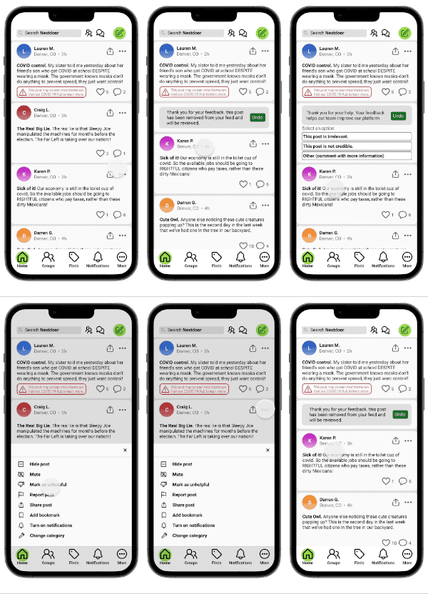
Let’s Keep It Simple:
Unhelpful/Helpful
Our comparative analysis suggested that marking something as “Unhelpful” can be done in a couple steps.
The post now, disappears at the end of the task and the undo button stays up to prevent user error.
Flagging COVID-19 Mis-Information in Red:
From our usability testing, it was clear that the flag needed to be on the post so users could identify which information to check up on.
The color red is meant to draw the user to the button but also evoke a sense of urgency and importance.
Finding the right information about COVID-19 is extremely important for public safety, we wanted to make sure users were getting the right information directly from Nextdoor, not searching through the CDC website.
Language is Important:
Designing a system for treating mis-information and bias is one of the greatest challenges facing the tech industry right now. Our team listened very carefully to the user who expressed the need for specific and effective language.
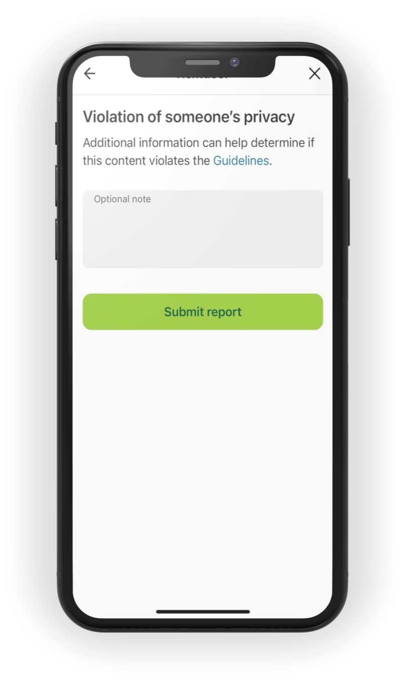
For our hi-fy iteration (Figure B), the categories for reporting discrimination include:
Goes against my beliefs, values, or politics
Racial or ethnic discrimination
Sexism or misogyny
LGBTQA+
Hate speech, violence, or threats
Vigilantism
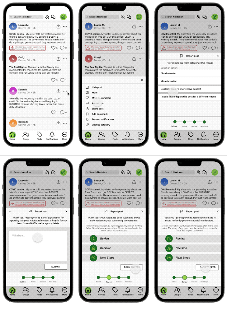
Reporting in High Fidelity:
Letting the user know that Nextdoor is takes them seriously.
The progress bar explains how Nextdoor will process a user’s report:
Submit-Review-Decision-Next Steps
Each step is explained in clickable links at the end of the flow.
The progress bar couldn’t just disappear after the report was made.
It was very important the Nextdoor stay transparent and continue to communicate where the report was in the review process.
UI & The Responsive Design
The new UI is less congested, on both the app & the web.
All menus & options are present on both devices but tucked into either the side bar menu or organized at the bottom of the app.
Insights to Our Approach
The process we took was extensive but there are so many ways to tackle this issue:
We focused much more on the user side of filtering content but the moderator plays a huge role as well. The moderator is a community member who filters content and solves problems on their section of the platform.
However, Moderators are human too and have their own prejudice and biases. In retrospect, focusing on their dashboard and filtering training would provide key components to solving the problem.
The UI was simplified extensively
The platform uses a lot of ads which is a huge part of their revenue but the interface often looks cluttered and untrustworthy. Our design did not include ads and photos which would have given it a more authentic look. However, the UI we chose to displays solved the problems we were facing.
Thank You!
Reflecting on the scope of this project and the meaning of the work.
I was impacted as a designer to use my skills and my professional career to continue solving humanitarian problems.
Today, technology and human interaction define the nature of our society. It is a moral obligation to lead with purpose toward building a better world.


